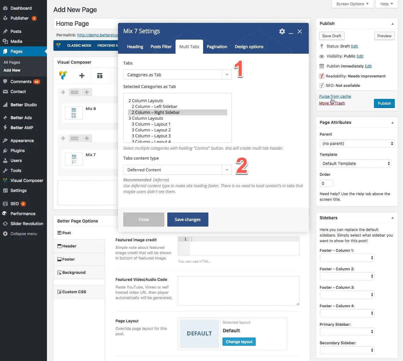
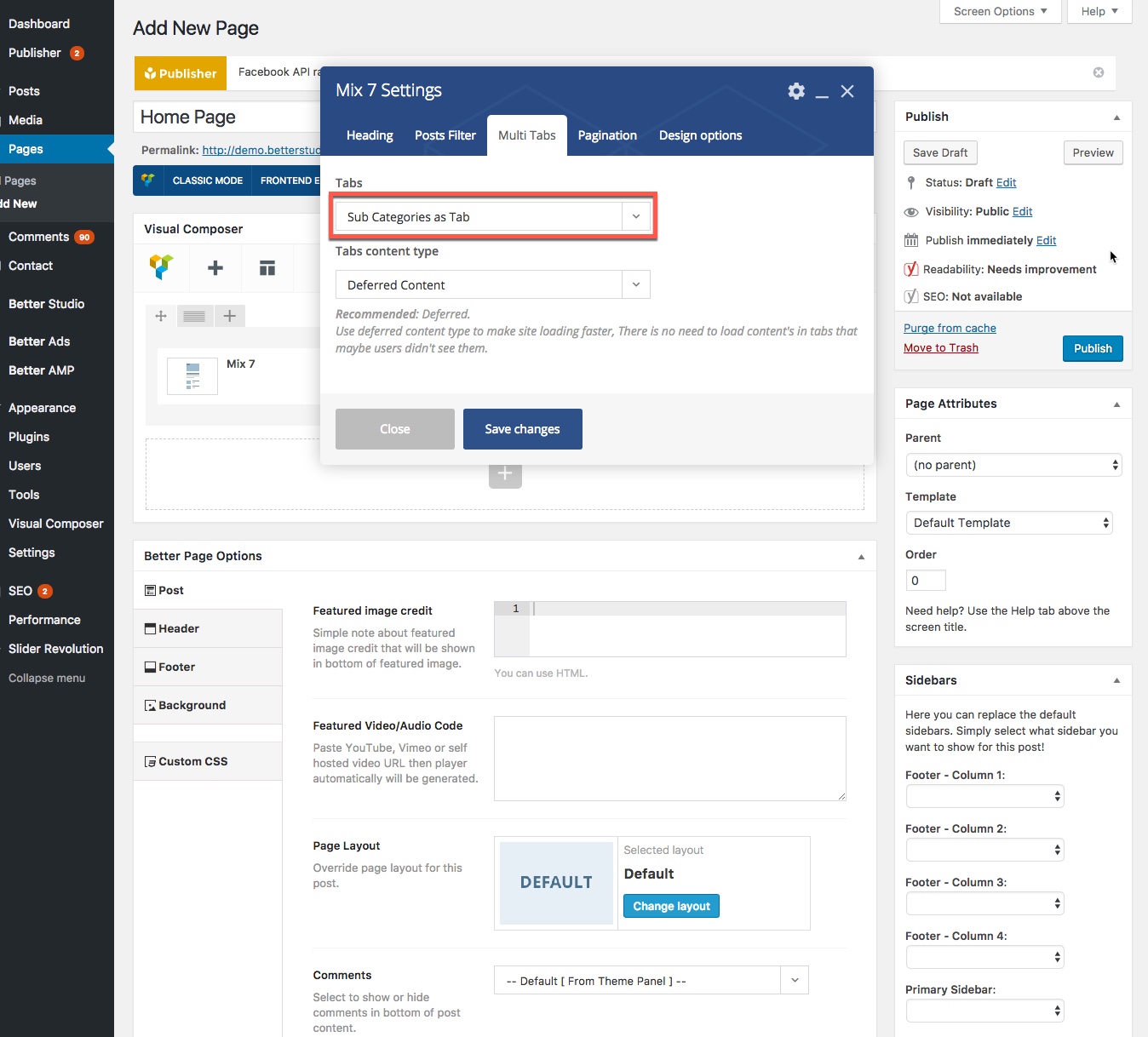
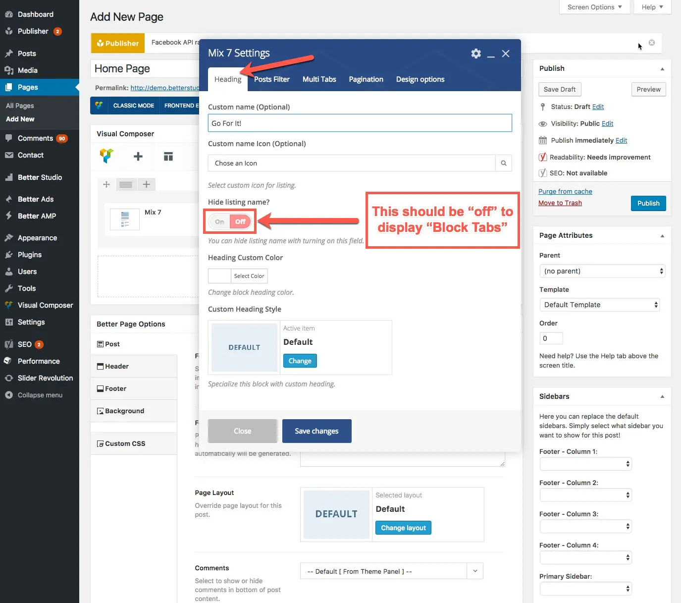
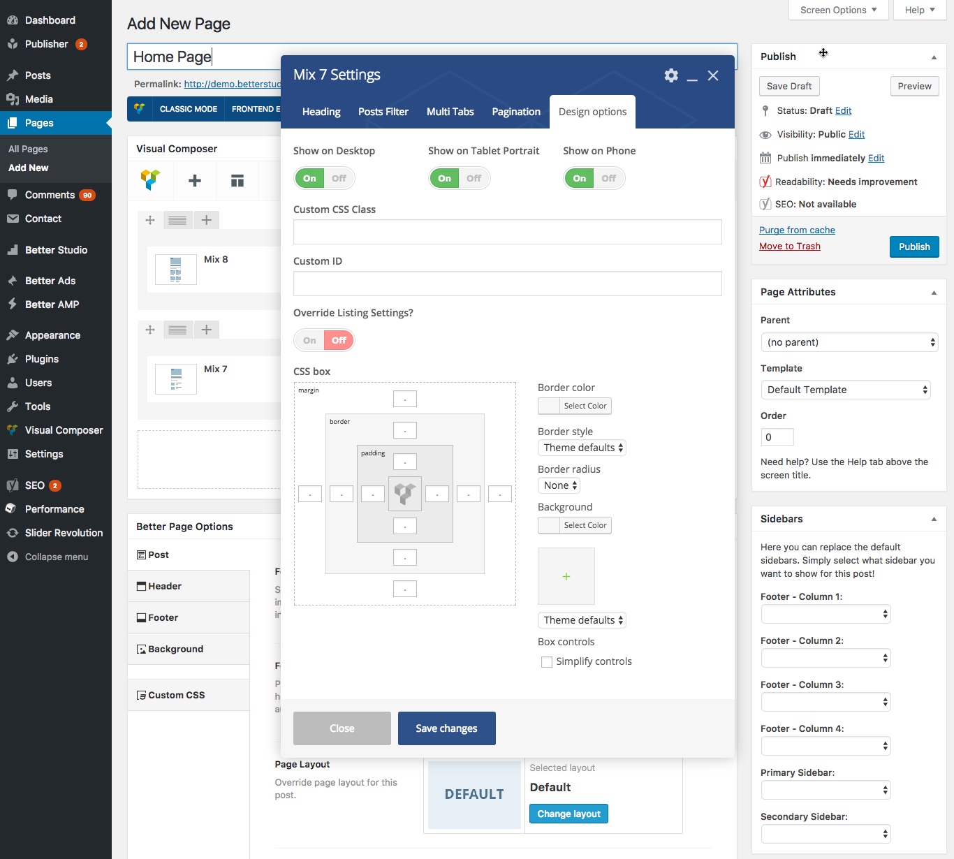
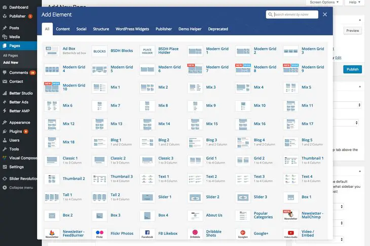
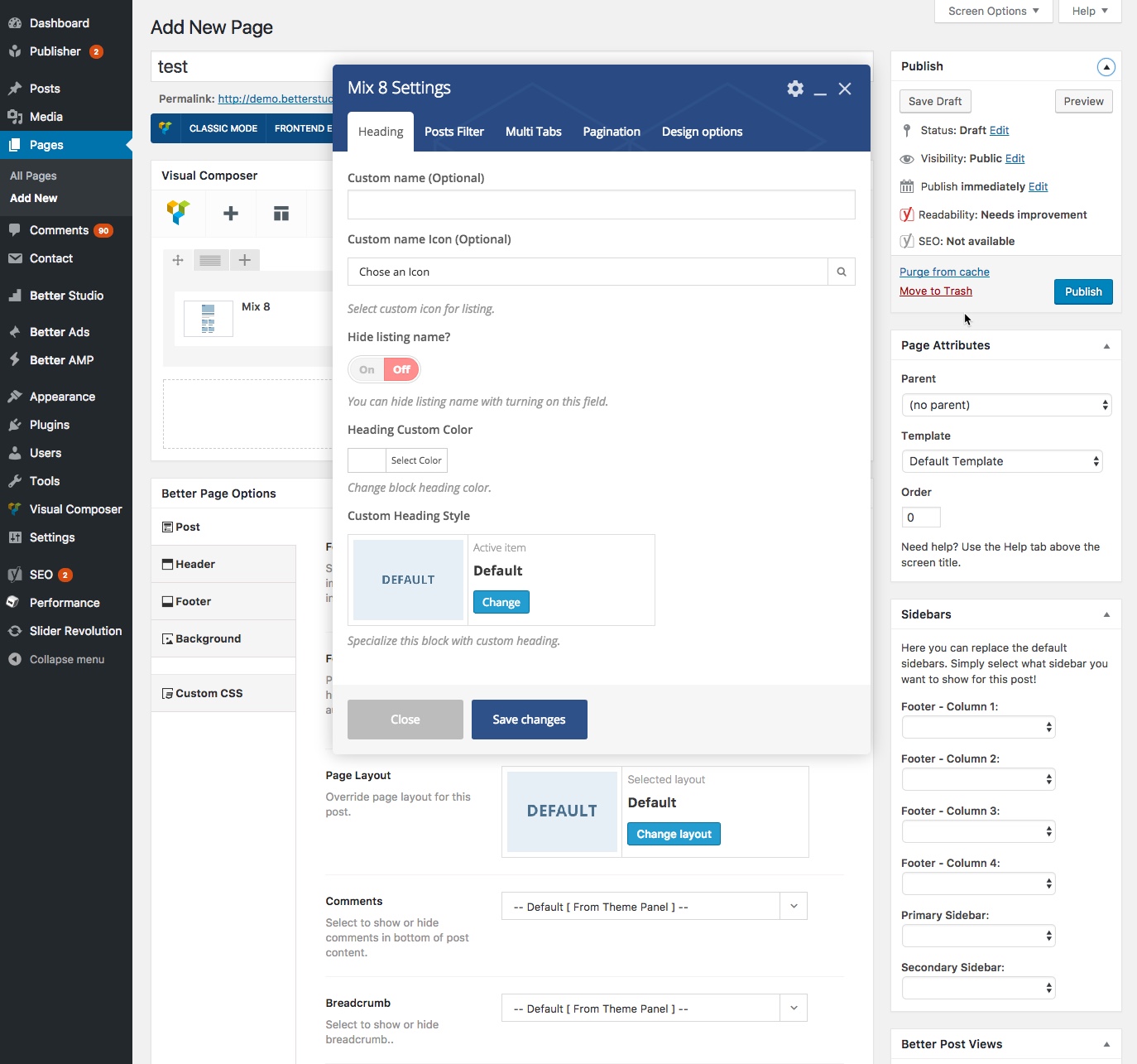
When you add a new content block as described in How to use content block?, a modal shows up with some tabs. Most of them are common between content blocks but there are exceptions like Slider content blocks. There is an option for showing more posts as slider in other blocks, so slider concept is some kind of common between all blocks. In this section we describe Pagination and Slider.
Pagination
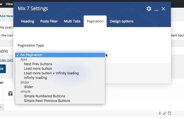
Ajax
When you use Ajax, new posts will be loaded in the same page without reloading the page. It saves time and increases performance. There are several paginations for Ajax content loading:
1- Next Prev buttons: Displaying a pair of simple buttons labeled Next and Prev. Click on them to load new content in the same page.
2- Load more button: The only different with the former is button. Here just one Load More button is displaying.
3- Load more button + infinity loading: Click the Load More button then scroll the page; the posts will load infinitely.
4- Infinity loading: Just scroll the page to load more content.
Slider
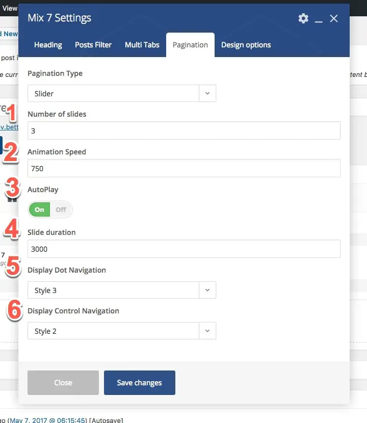
By selecting slider pagination, new content will display as slider. We describe options in more detail.
1- Number of slides: How many slides you want to create and display.
2- Animation Speed: The time animation endures (in millisecond).
3- AutoPlay: If you set it off, changing slides is just possible by clicking next and previous buttons.
4- Slide Duration: The time every slide is displaying (in millisecond).
5- Display Dot Navigation: Show some dots on slider to notify which slider you are seeing.
6- Display Control Navigation: Show buttons for changing between sliders.
Simple
In simple mode, by loading new content, the page reloads too. It could be a little annoying and time consuming for visitors. By the way there are two options for that:
1- Simple Numbered Buttons: Shows an array of simple numbered buttons. Click on them, new content and new page will load.
2- Simple Next Previous Buttons: Show two buttons for loading newer and older posts.
Slider Content Block

If you select Slider content block you will see a tab labeled Slider. We describe its options.
1- Animation: Choose between two effect for changing slides: fade or slide.
2- Slideshow Speed: The time every slide is displaying (in millisecond).
3- Animation Speed: The time animation endures (in millisecond).
Other tabs in slider content block are the same as other content blocks.
