What is Site Size?
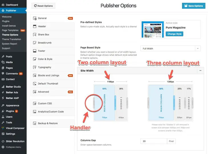
Site size means maximum width of your content and sidebars in a big enough monitor. Publisher makes it very easy and user friendly to resize site width, columns size and the gap between them. Go to Publisher → General → Site Width, here you can resize your “two column” and “three column” layouts simply by sliding columns.
How to Change Columns Width?
As you see in above image, “two column” and “three column” layouts have their own sizing. Just grab handlers and resize them to desired pixel. Use internal handlers to change every column size in percentage of the total width.
You can use different layouts for different pages in Publisher (2 column or 3 column). Every layout uses its own sizing. For example your homepage is “three column” layout with a total width of 1300px, and posts use “two column” layout with total width of 1200px, then your website homepage looks different from posts.
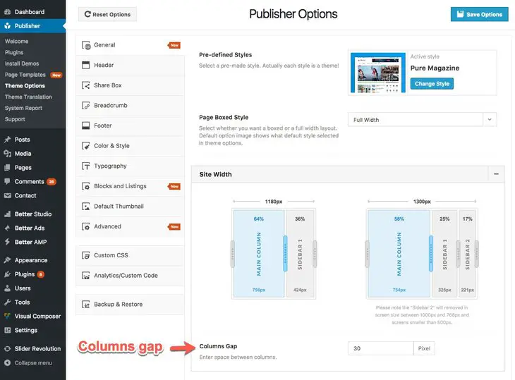
How to Change the Gap Between Columns?
See image above, change Columns Gap to your desired number (in pixels). This gap is both vertically and horizontally.
Apply Site Width For Content Blocks
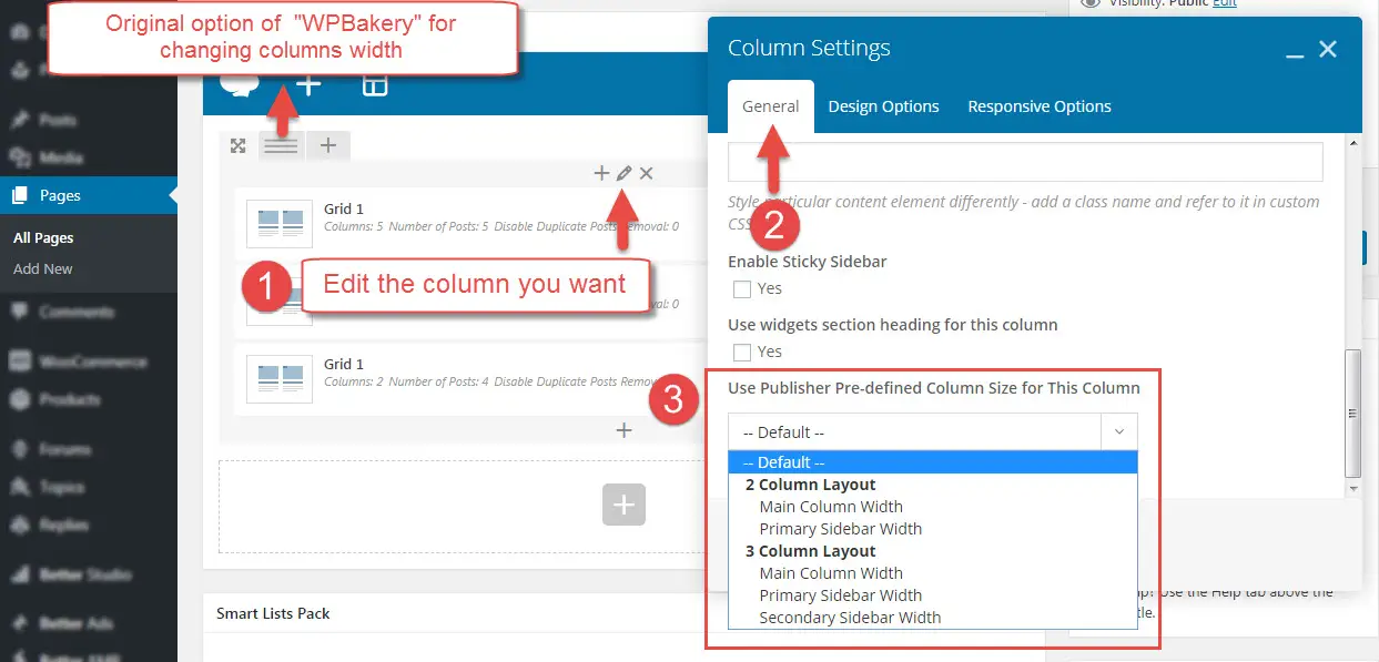
Normally content blocks use “WPBakery” column width which is adjustable when you edit page with “WPBakery” homepage builder. In Publisher there is an option in WPBakery columns for using site width you selected in Publisher. For using this feature edit your page and edit the column you want.
Now select width of the columns. For example if you select 2 Column Layout → Main Column Width, then the width (in percent) of this will be the width you selected for main column of “2 Column Layout”.
Also if select Default, this column uses WPBakery width option.
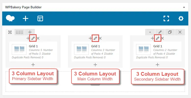
When you have several columns in one row, it’s possible edit their width one be one and make this row uses the exact option of site width in Publisher.


