What is “Global Options” for Publisher Widgets?
When you activate different widgets, you see some options that are the same through nearly all the widgets. Global Options of widgets refers to them. Publisher Custom Widgets fully covers activating widgets, read that to know how to add widgets. In this section we want to describe these options. As mentioned above, there is another section about adding widgets and we dodge this topic here, just as an example, open a widget setting panel to see its Global Options and learn more about them one by one.
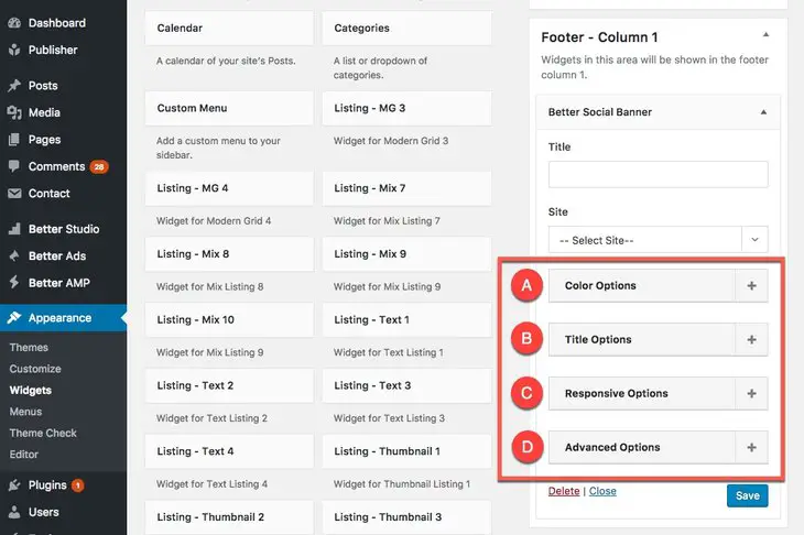
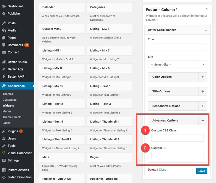
Go to Appearance → Widgets, select one of the Publisher custom widgets. Global Options marked by red rectangular in below image.
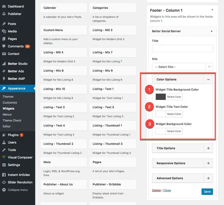
A- Color Options
1- Widget Title Background Color: Color of top line of the widget.
2- Widget Title Text Color: Color of title font. When it is blank, automatically uses Widget Title Background Color.
3- Widget Background Color: Color of whole widget background.
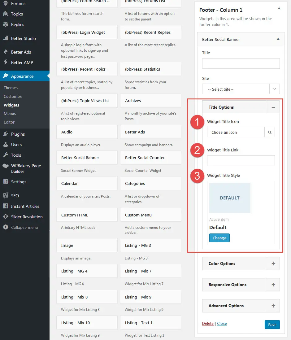
B- Title Options
1- Widget Title Icon: Click on magnifier icon and select an icon for widget title among hundreds of Font Awesome Icons.
2- Widget Title Link: Create a hyperlink for widget title. Paste the address you want in this format: http://www.betterstudio.com
3- Widget Title Style: Select style of widget heading. It overrides default heading style selected in theme options.
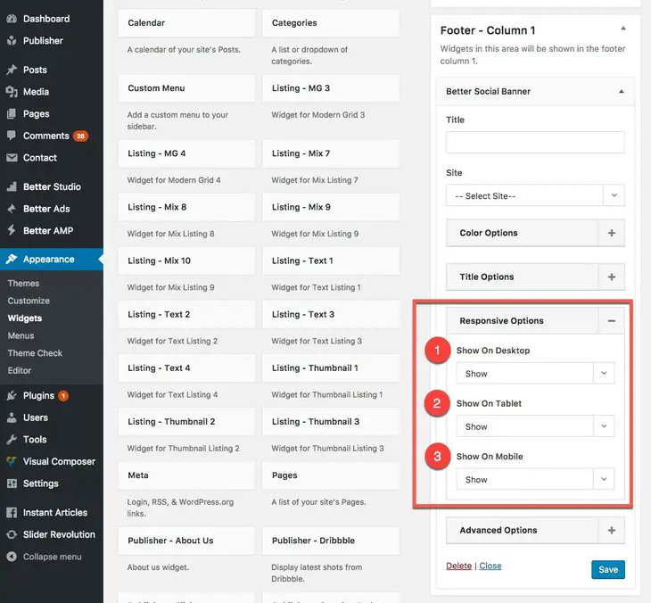
C- Responsive Options
1- Show on Desktop: Show/hide this widget on desktop computers.
2- Show on Tablet: Show/hide this widget on Tablets.
3- Show on Mobile: Show/hide this widget on Mobile Phones.
D- Advanced Options
1- Custom CSS Class: Add a class (or some classes) to this widget then you can assign custom CSS to it.
2- Custom ID: Add an ID to this widget then you can assign custom CSS to it.

