What is Mobile Header?
In mobile devices, header (i.e logo, menu and Topbar) changes into Mobile Header. This header is compact and is very customizable. Let’s take a look at its options.
Mobile Header Options
Find its options in Publisher → Theme Options → Header → Mobile Header
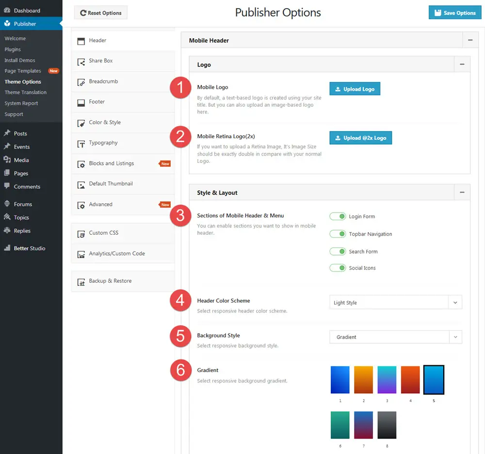
1- Mobile Logo: By default, a text-based logo is created using your site title. But you can also upload an image-based logo here.
2- Mobile Retina Logo(2x): You can upload a Retina Image. It’s dimensions should be exactly double in comparison with normal Logo.
3- Sections of Mobile Header & Menu: Enable sections you want to show in mobile header. Items are:
- Login Form
- Topbar Navigation
- Search Form
- Social Icons
4-Header Color Scheme: There are two options for the color scheme:
- Dark Style
- Light Style
5-Background Style: Select a style for your background. Options are:
- Gradient
- Simple Color
- Background-image
5- Gradient/Background Color/Background Image: Depending on what you selected in option number 4, you should select a gradient, color or image for mobile menu background.
Mobile Menu (Responsive Menu)
The menu displayed in mobile (or responsive) header is called “Responsive Menu”. Read more about creating and selecting menus.