We talked about thumbnails and their importance before. One thing you should be aware of when selecting featured image, is that images are cropped and resized by WordPress to produce thumbnails. So it is not a good practice to use images which you insist to show special part of them in all thumbnails. Of course it is possible but you should select proper image size at first place.
Aspect Ratio
The ratio of the width to the height of an image is called “aspect ratio”. This is basis for WordPress thumbnail creating functionality.
How WordPress Crop and Resize Images
First of all it measures original image and needed thumbnail aspect ratios. Let’s say original image size is 1500×2200 pixels and theme has a thumbnail 90×60 pixels.
Original image aspect ratio: (1500 / 2200) = 0.68
Thumbnail aspect ratio: (90 / 60) = 1.5
So it is obvious now the original image is too taller than that the thumbnail could be created just by resizing. It needs cropping first. Original image aspect ratio should change to 1.5 which means height should be decreased.
New height of original image: (1500 / 1.5 ) = 1000
Original image new aspect ration: (1500 / 1000) = 1.5
After making both aspect ratios the same, it’s time for resizing.
Width: 1500 * (90 / 1500) = 90
Height: 1000 * (90 / 1500) = 60
This was an example for “tall” image. If the original image is wide (its aspect ratio bigger than thumbnail aspect ratio), the original image should be cropped horizontally before resizing.
But how WordPress crops images? From top or bottom? right or left? In Publisher, cropping is equal in both sides. For example, an image need 200px crop in height; 100px in top of the image and 100px in the bottom of the image is cropped.
Thumbnails in “Publisher”
Publisher defines 9 thumbnails:
| Name | Size | Aspect ratio | |
|---|---|---|---|
| 1 | publisher-tb1 | 86 x 64 pixel | 1.34 |
| 2 | publisher-sm | 210 x 136 pixel | 1.54 |
| 3 | publisher-mg2 | 279 x 220 pixel | 1.27 |
| 4 | publisher-md | 357 x 210 pixel | 1.7 |
| 5 | publisher-lg | 750 x 430 pixel | 1.74 |
| 6 | publisher-full | 1130 x 580 pixel | 1.95 |
| 7 | publisher-tall-sm | 180 x 217 pixel | 0.83 |
| 8 | publisher-tall-lg | 267 x 322 pixel | 0.83 |
| 9 | publisher-tall-big | 368 x 445 pixel | 0.83 |
Let’s take a look at two bad sized featured images. First one is a tall image.
Original image (image size reduced 3 times to look better in this page – image size is 750 x 1124 pixel):

And the thumbanils 750x430px is (image size reduced 3 times to look better in this page):
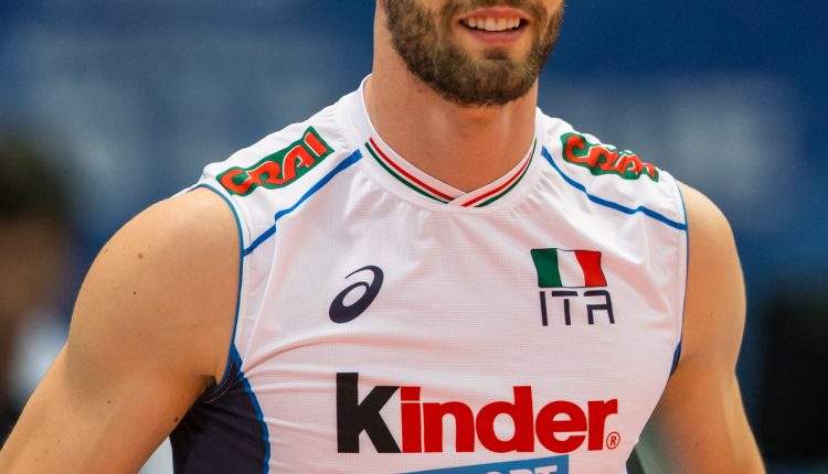
You see original tall image is not good at all in dominant size (750x430px) thumbnail.
Another example is too wide image.
Original image (image size reduced 2 times to look better in this page – image size is 1076 x 430 pixel):

The thumbnails 180x217px is (image size reduced 2 times to look better in this page):

Again it is not a good size. Too wide images have this problem.
FAQ: How to show featured content in thumbnails all the times?
Some users want to show specific part of their featured image all the time. For example one wants to show “The New York Times” in above image in all thumbnails. Do not try this. No just in Publisher, do not try it in all WordPress themes which use thumbnails. Rather than image cropping, it might resize dynamically somewhere in the theme and waste all your efforts to show specific content in featured image anyway. As we said it is possible but not pleasant. Narrow down the content you want to show in a small area in the center of image. For example you use different thumbnails in your theme and their smallest aspect ratio is 1.27 (publisher-mg2) and biggest one is 1.74 (publisher-lg). Now your specific content should be inside an area with below width and height:
Width: 1.27 * (image height)
Height: (image width) / 1.74
Look at below example:
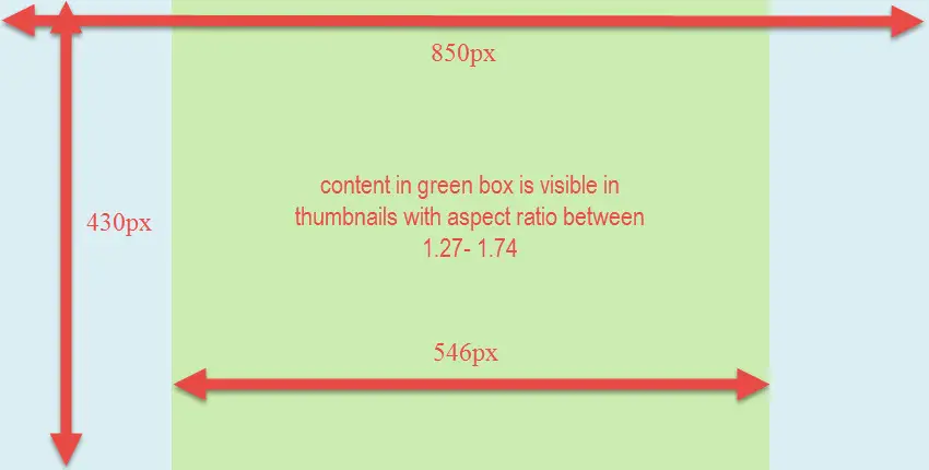
Image size is 850x430px. By using above formulas, width is 546px and height is 489px. Image height is smaller than 489px so we say 430px is completely covered.

